For data visualization in graphical form, the basic building blocks are well identified: Visual marks such as lines or areas carry information - and they have roughly the following "visual variables" that can be modified in order to express information:

What excites us about data cuisine is the abundance of additional "culinary variables"we can use to express information!
Of course, all of the above are available (2D painting with food). Then we have all kinds of sculptural 3D possibilities. We can work with taste - from the basic tastes of sweet, sour, salty, bitter, umami to complex combinations or hotness. There is texture - immensely important in cooking! Then we have all the cultural connotations of ingredients and dishes (potatoes, caviar, ...). We can work with cooking parameters (e.g. baking temperature or duration). Or the temperature of the dish itself, when served! And all the little decision that go into plating and food presentation...
The possibilities seem endless!
One open question here is definitely the perception of these new "culinary variables". We know how people, for instance, tend to estimate the size of areas - but how do you make something "twice as salty"? Will adding the double amount of salt lead to the desired result? Or is the relation between stimulus (amount of salt) and perception of the amount non-linear?
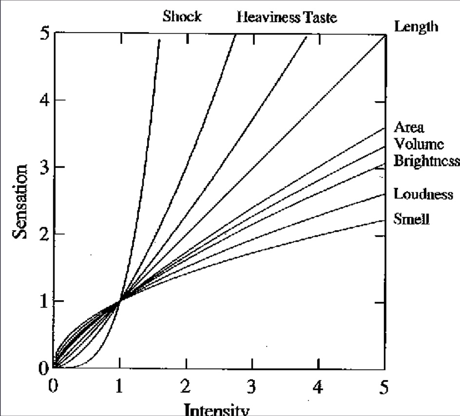
(from Stevens, On the Theory of Scales of Measurement, Science 103:2684, 1946)
Here are a few food-data-visualization-related resources we came across while doing research, and which we would like to share:
http://bindersfullofburgers.tumblr.com

"I read an article in The Economist about the World Happiness Report, published by the Earth Institute for the United Nations Conference on Happiness, edited by Jeffrey Sachs, Richard Layard and John Helliwell.
[...]
I wanted to make the data tangible, palatable, spark interest in the dry report.
So, I set about baking the Happy Index into cupcakes. 96 of them, where each country had its own, unique amount of sugar, starting with Bulgaria, who had the least amount of happiness and the least amount of sugar.
I used colored cupcake wrappers— dark blue for the least happy countries, then, in increasing happiness, brown, yellow, pink and bright red for the most happy.
I then asked the people who ate the cupcakes to plot how sweet they found the cupcake by pinning the wrapper onto a board. They considered their own subjective measure of sweetness— ideally tasting a few cupcakes so that they had some sort of point of reference.
They were able to check how closely their plotting matched the formal graph of the Happy Index (a video feed of the pinboard was projected on the formal graph).
For the show, I baked 5 rounds of the Cupcakes Index! I collected all of the boards, with their pinned wrappers, and have attached an image of all of these boards.
"

"Have you ever wondered what twitter tastes like?
Tasty Tweets is a data visualization experiment that allows users to explore current twitter trends through taste, with a press of a button.
Using the Twitter API, it collects tweets containing mentions of specific fruits such as blueberry, pineapple, apple and carrot and creates a smoothie that represents the blend. The smoothie is created based on the same proportions of fruits collected from the tweets. Because twitter trends change quickly, each smoothie has a unique palette of flavors."

I've set out to make the sandwich for each of the 50 states as a fun way to work on my photography and design skills. It will be quite a delicious journey across the US. Before I make each sandwich I do research on the Internet, call local sandwich shops, ask foodies on twitter and check out a few books to be sure I do my best to properly represent a state.

CURIOUS ABOUT CALORIES?
SERIOUS ABOUT SUGARS?
FLUMMOXED BY FAT?
This series of infotography will guide you through your favourite naughty snacks breaking down the nutritional information bite by bite!
Bon appetit!
Interesting food research
Food pairing networks
Nutrition database
Visualizing Food 40 Ways
Food pairing explorer